An Introduction to Grids in SwiftUI
Grids are a powerful layout tool that have been introduced in SwiftUI as of WWDC 2022. They allow developers to create dynamic and responsive layouts that can adapt to various screen sizes and device orientations.
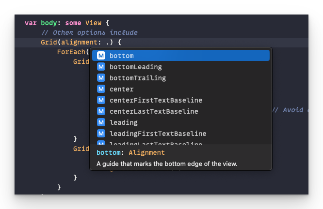
Defining Alignment in Grids
One of the foundational concepts in working with grids in SwiftUI is defining cell alignment. By default, cells are aligned to the leading position, which centers the content within the cell. However, it is possible to override this alignment on a per-column basis. This means that you can have some columns aligned to the left, some to the right, and some centered.
struct Leaderboard: View {
    @EnvironmentObject private var model: Model

    var body: some View {
        Grid(alignment: .trailing) {
            ForEach(model.pets) { pet in
                GridRow {
                    Text(pet.type)
                        .gridColumnAlignment(.leading)
                    ProgressView(
                        value: Double(pet.votes),
                        total: Double(max(1, model.totalVotes))) // Avoid dividing by zero.
                    Text("\(pet.votes+99)")
                        .gridColumnAlignment(.trailing)
                }
            }
        }
        .padding()
    }
}
Here's a sample grid. This project can be found in Apple developer documentation.

Spanning Multiple Columns
Another powerful feature of grids in SwiftUI is the ability to span a single cell across multiple columns. This can be useful for creating headers or footers that need to span the entire width of the grid.
    var body: some View {
        Grid(alignment: .leading) {
            GridRow {
                Text("hello")
                    .gridCellColumns(3)
            }
        }
        .padding()
}Understanding GridRow Sizing
The size of each row in a grid is determined by the largest item in that row. For example, if a row contains a text element and a progress view, the row will be sized based on the largest of those two elements.
Conclusion
Grids are a powerful tool that can help developers create dynamic and responsive layouts in SwiftUI. By understanding the foundational concepts of defining alignment, spanning columns, and understanding GridRow sizing, developers can create powerful and flexible layouts that adapt to various screen sizes and device orientations.

